LinkedIn Carousel Examples: 6 Slide-by-Slide Outlines

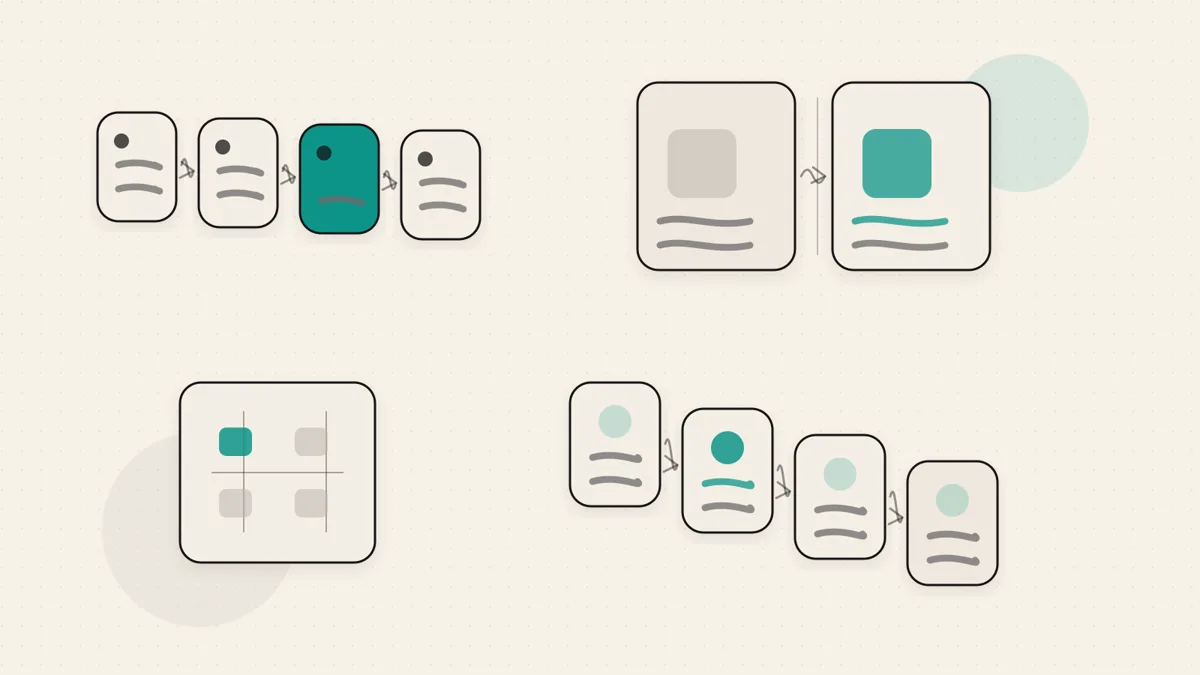
These six LinkedIn carousel examples are original illustrative outlines, not real branded campaigns or proven engagement winners. Choose one by the task you want to explain, then replace the sample situation with work and evidence you can publish. Each outline includes a goal, slide sequence and closing action.
For a usable starting outline, download the six-slide storyboard worksheet. It is a CSV planning sheet with blank copy and evidence fields, not a designed deck or AI carousel generator. Check the carousel dimensions and official PDF limits before exporting, then check the caption with the character counter.
TL;DR
- 🧱 A carousel is a structure, not a screenshot. Pick the goal first, then choose the shape that fits it.
- 🪝 Slide one earns the first swipe. It should name a real tension, promise, or question.
- 1️⃣ One slide carries one point. Dense cards feel like homework, especially on mobile.
- 🔁 Choose by task. Use steps for a process, a comparison for a change or a case study for documented work.
- 🎯 The last slide needs a job. Recap, invite a reply, point to a next step, or ask people to save it.
- ✍️ The words are the hard part. Design helps, but slide copy is what makes someone keep swiping.
How to use these LinkedIn carousel examples
Treat each example as a container, not a script. The container gives you sequence and momentum. Your own work gives it credibility.
For each concept below, ask four questions before you design anything:
- Who is this for?
- What should the reader understand or do by the end?
- What has to be on slide one for them to care?
- What should the last slide ask them to do next?
If you want the upload process, export format, and posting steps, use our guide on how to make a LinkedIn carousel. If you need exact dimensions, use the LinkedIn carousel size guide. This page stays focused on the content structure: what to actually put on the slides.
1. The how to teardown
Who it is for: consultants, operators, founders, and coaches who get asked the same practical question again and again.
Goal: teach one small task so clearly that the reader could try it today.
Hook, slide 1: name the task and the friction. For example, make the first slide promise a simpler way to solve something your audience currently overcomplicates.
Slide by slide skeleton:
- Slide 1: the task plus the promise. Show the reader what they will be able to do.
- Slide 2: the problem with the usual way people approach it.
- Slide 3: step one, the setup.
- Slide 4: step two, the first real action.
- Slide 5: step three, the decision point most people miss.
- Slide 6: step four, the cleanup or review.
- Slide 7: the common mistake that breaks the process.
- Slide 8: the recap in one short checklist.
Closing slide and CTA: ask readers to save it for the next time they face the task, or invite them to comment with the step they usually get stuck on.
Use this outline when the order matters. Avoid it when there is no real process or when critical prerequisites will not fit; add the prerequisites rather than implying anyone can follow the steps.
2. The numbered listicle
Who it is for: people with a lot of small, useful observations from doing the work. It works well for solo consultants because your expertise often shows up as pattern recognition.
Goal: package several quick ideas into something easy to scan and save.
Hook, slide 1: use a specific number plus a specific audience or situation. Broad listicles feel disposable. Narrow listicles feel useful.
Slide by slide skeleton:
- Slide 1: the number and the topic, such as a list of mistakes, prompts, signals, habits, or questions.
- Slide 2: item one, the most familiar one, so the reader feels seen fast.
- Slide 3: item two, slightly less obvious.
- Slide 4: item three, the first real insight.
- Slide 5: item four, a practical detail.
- Slide 6: item five, a counterintuitive point.
- Slide 7: item six, the one you wish more people noticed.
- Slide 8: the one item to start with if the reader does nothing else.
- Slide 9: a quick recap or saved checklist.
Closing slide and CTA: ask which item they would add, or tell them to save the list for the next time they work on the topic.
Keep each item distinct. If two slides give the same check in different words, combine them. Do not add weak items merely to reach the number promised on the cover.
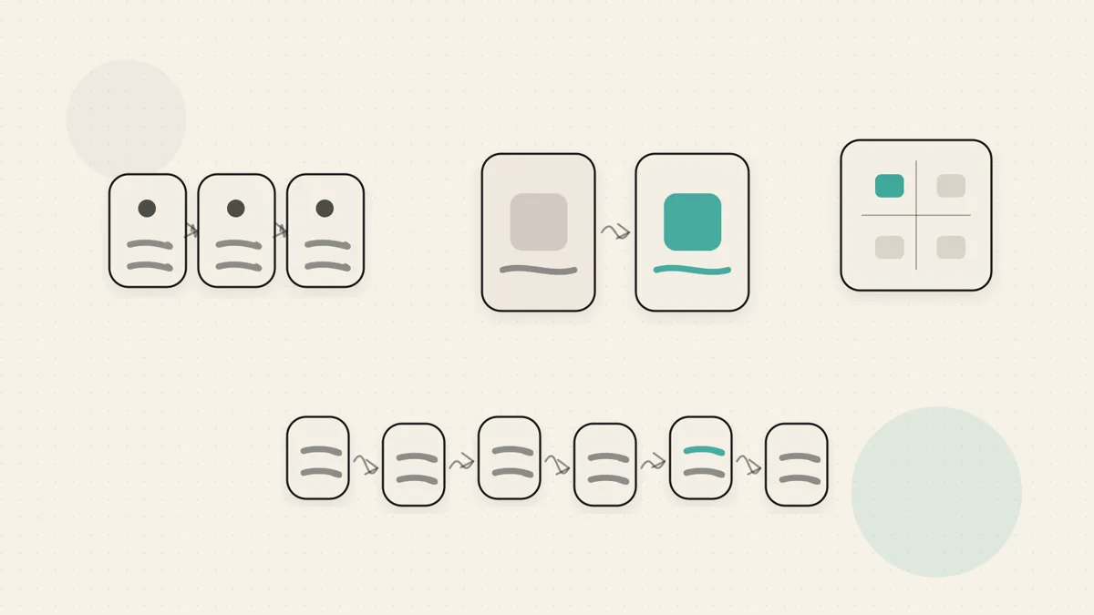
3. The before and after story
Who it is for: anyone who can show a real transformation without exaggerating it: a project cleaned up, a positioning problem clarified, a process made simpler, a founder getting unstuck.
Goal: make change visible by showing the starting point, the turning point, and the better state.
Hook, slide 1: open with the uncomfortable before. The reader should immediately understand what was not working.
Slide by slide skeleton:
- Slide 1: the before state, concrete and plain.
- Slide 2: why the before state hurt or slowed things down.
- Slide 3: the clue that changed how you saw the problem.
- Slide 4: the first change you made.
- Slide 5: the second change you made.
- Slide 6: the after state, described as specifically as the before.
- Slide 7: the lesson someone else can reuse.
- Slide 8: the question or next step for the reader.
Closing slide and CTA: ask readers where they see the same before state in their own work, or invite them to reply if they want help spotting the shift.
Show the evidence and observation period for the change. Keep the result honest: no invented numbers, fake client wins or polished story that never happened. A before-and-after example alone does not prove the intervention caused the outcome.
4. The framework or mental model
Who it is for: strategists, advisors, founders, and subject matter experts whose value is not only in what they do, but in how they think.
Goal: give readers a reusable way to make a decision, diagnose a problem, or explain a messy topic.
Hook, slide 1: name the situation the model helps with. The model itself does not need a cute name. It needs to solve a real moment of confusion.
Slide by slide skeleton:
- Slide 1: the problem the framework helps solve.
- Slide 2: why the old way of thinking creates confusion.
- Slide 3: the whole framework at a glance.
- Slide 4: part one, with a simple example.
- Slide 5: part two, with a simple example.
- Slide 6: part three, with a simple example.
- Slide 7: when the framework does not apply.
- Slide 8: the one sentence version people can remember.
Closing slide and CTA: invite people to use the model on their current decision, or ask them which part of the framework they want you to unpack next.
State when the framework does not apply. If it cannot handle an important constraint, show the exception instead of presenting a universal rule.
5. The myth-buster
Who it is for: people who can disagree with common advice in their field and explain the better alternative without turning it into a cheap hot take.
Goal: replace a belief your audience has with a more useful one.
Hook, slide 1: state the common belief fairly, then signal the problem with it. The tension is what earns the swipe.
Slide by slide skeleton:
- Slide 1: the myth, stated the way your audience actually says it.
- Slide 2: why the myth sounds reasonable.
- Slide 3: where the myth breaks down.
- Slide 4: what is actually happening instead.
- Slide 5: the cost of believing the myth too long.
- Slide 6: the better belief.
- Slide 7: what to do differently this week.
- Slide 8: the new rule of thumb.
Closing slide and CTA: ask people whether they have seen the same myth in their field, or invite disagreement if they have a better version.
Use this only when you can support the correction. State the common advice fairly and show where it stops applying instead of inventing a weak position to attack.
6. The mini case study
Who it is for: consultants, agencies, freelancers, and founders who want to show proof without writing a full sales page.
Goal: show how you think through one real piece of work, from problem to decision to outcome.
Hook, slide 1: start with the situation before the work began. Make the reader curious about what changed and why.
Slide by slide skeleton:
- Slide 1: the starting situation.
- Slide 2: the problem behind the problem.
- Slide 3: the constraint that shaped the work.
- Slide 4: the first decision you made.
- Slide 5: the tradeoff you chose and why.
- Slide 6: what changed after the work.
- Slide 7: what you would repeat next time.
- Slide 8: what you would do differently.
- Slide 9: who this lesson is relevant for.
Closing slide and CTA: invite the right reader to reach out if their situation looks similar, or ask a specific question that starts a useful comment thread.
The mini case study is powerful because it shows judgment. The point is not to brag. The point is to let a reader see how you approach real work. Specifics do the selling, as long as they are true.
Verify the outline before designing
Ask an intended reader to review the plain-text sequence: can they identify the point, follow the order and act on the final slide? Check every result, client reference and quote for evidence and permission. Remove repetitive slides, and put a limitation beside the advice it qualifies.
After design, inspect the exported deck at phone size. A clear outline can still become unreadable when labels or source notes are too small. These checks assess usability, not a promised reach or dwell-time lift.
Now build and post it
Once the slide copy is written, the rest is mechanical. For the build and posting process, use how to make a LinkedIn carousel. For exact canvas dimensions and file specs, use the LinkedIn carousel size guide.
Before you post, check the caption too. The carousel has to earn swipes, but the post text still frames why someone should stop. You can draft the caption and hook with the LinkedIn post generator, then check how the opening appears in the feed with the LinkedIn post preview tool.
WriteHero can help draft text from your idea; it does not currently generate the designed slide deck. Review the words and evidence before using them, then check the final uploaded document in LinkedIn.
Choose your next step
Frequently asked questions
What is a good LinkedIn carousel example to start with?
Start with the how to teardown. Pick one small task your audience already tries to do, break it into clear steps, and give one step per slide. It has a natural beginning, middle, and end, so you can focus on the words rather than inventing the structure.
How many slides should a LinkedIn carousel have?
Six to ten slides is a planning starting point for these outlines, not an official requirement or tested optimum. Use enough slides to explain the task without repetition. If the point fits clearly in a short text post, you may not need a carousel.
What makes a good first slide for a LinkedIn carousel?
A good first slide names a specific tension, promise, or question your audience already cares about. It should make the reader feel there is a reason to swipe, not just announce the topic. Clear beats clever. Specific beats broad.
Which LinkedIn carousel type is best for reach?
This guide does not establish a reach winner. Match the outline to the reader's task: steps for a process, a list for several checks, or a case study for a documented piece of work. Assess actual results rather than choosing a type from an engagement promise.
Should a LinkedIn carousel be mostly text or visuals?
Use the representation the idea needs. A diagram can explain a relationship; text can explain a short step. Inspect the exported deck at phone size and ask whether the reader can understand it without your explanation. These outlines are not evidence that text cards outperform graphics.
Related guides
Browse Writing WritingJuly 3, 2026
How to Make a LinkedIn Carousel: Sizes, Examples, and How to Post
There is no carousel button on LinkedIn. A LinkedIn carousel is a document post: upload a multi-page PDF and each page becomes one swipeable slide.
Read more WritingJuly 3, 2026
How to Write a LinkedIn Post That Sounds Like You
A practical guide to writing LinkedIn posts that earn attention without sounding generic: hook, body, takeaway, voice, formatting, and final checks.
Read more WritingJuly 3, 2026
LinkedIn Carousel Size: Dimensions, PDF Limits and Export Checklist
Separate practical slide dimensions from LinkedIn's actual upload limits, then check your PDF before publishing.
Read more
See your first post, in your voice
Paste your LinkedIn profile and WriteHero drafts a post that sounds like you. See it before you sign up, no login needed. Create an account later to save the draft.